How to make your posts readable, aesthetic, and scrollable
🌱 1. Before Anything Else: The Vibe
Online+ is a place for expression, curiosity, discovery, and community. We don’t shape what you talk about — that belongs to you.
All we ask is simple:
- Keep things respectful
- Don’t spread hate or harassment
- Avoid FUD or fear-baiting for the sake of drama
Beyond that? Say whatever you want. This guide is only about making it look great.
✨ 2. Universal Tips for All Post Types
These apply whether you’re posting a hot take, writing a long article, sharing a story, or launching a poll.
2.1 Make it scannable
People scroll fast. Clear, airy formatting helps them actually read you.
Try:
- Short lines and short paragraphs
- Blank lines between ideas
- One main thought per chunk
2.2 Write like a human
Friendly, simple language always performs better than stiff, formal writing.
Avoid:
- Dense jargon blocks
- Huge paragraphs glued together
- Heavy marketing or corporate-speak
Aim for:
- Conversational tone
- Clear sentences
- A little personality
2.3 Emojis = accents, not confetti
Use them sparingly and purposefully.
- Think 1–3 per post or per screen
- Use them to guide the eye
- Not to replace words
- And not in long chains
Tasteful > noisy.
2.4 Images matter — clarity wins
If you add visuals, make sure they’re:
- Clear (no pixelation, no tiny text)
- Relevant
- Easy to see on mobile
- Not cluttered
- No watermarks, of course
Good images elevate a post. Bad images distract from it.
2.5 Accessibility = good design
Small effort, big payoff:
- Use real, standalone text, not text baked into an image
- Avoid giant all-caps paragraphs
- Keep contrast high if text is over a photo
In short: if people can read it comfortably, they’re far more likely to enjoy it.
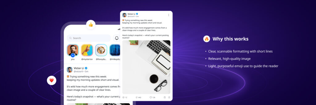
📝 3. Short Posts
Short posts are your quick thoughts, updates, questions, mini-stories.
3.1 A structure that just works
A simple, tried-and-tested formula for readability:
- A hook line (at the start)
- 1–3 short lines explaining your thought
- Optional question or call to action
Example structure:
“Question for the hive mind:
What’s one thing you changed recently that made your posts feel better?
Sharing mine below 👇”
Readable, breathy, human — that’s the idea.
3.2 Formatting that feels native
- Break lines intentionally
- Give each idea its own space
- Place links on their own line if possible
3.3 When to add media
Add a visual only if it adds meaning:
A chart, a screenshot, a product, a reaction — all good.
Random stock photos or unrelated shock-factor images? Less good.
🎨 4. Stories
Stories are for behind-the-scenes, snapshots, quick updates, previews.
4.1 Big, readable text
Imagine the smallest phone + the worst lighting.
Make text large and short enough to read instantly, and images and videos quick and easy to take in.
4.2 Visuals that speak instantly
Our brains process images way faster than text — stories shine when they’re instantly understandable.
Use images and videos that are clear, focused, and easy to digest at a glance.
4.3 Keep the layout clean
- Safe margins (don’t place text at the very top/bottom)
- High contrast text
- One visual focus per slide
4.4 One idea per slide
Got more to say than fits a single screen? Break it up.
- Slide 1: the hook
- Slide 2–3: the details
- Slide 4: optional, but this would be the place for your question, CTA, or conclusion
Think of Stories as quick snapshots — small, focused moments that land best one screen at a time.

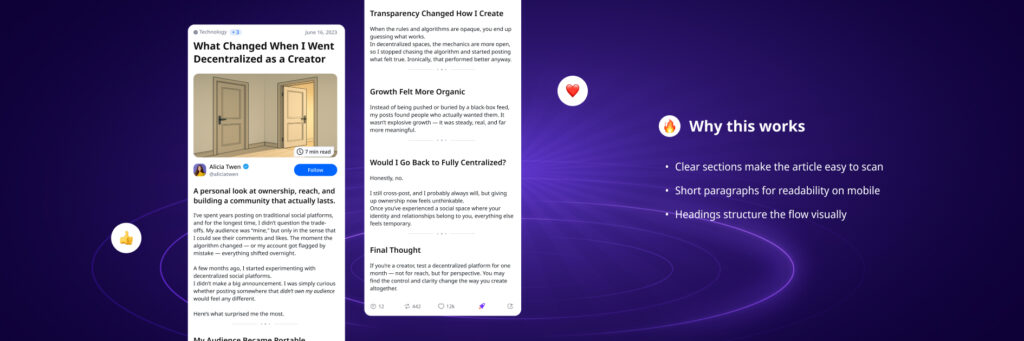
📚 5. Articles and Long-Form Posts
Articles let you go deep — insights, stories, guides, essays.
5.1 Titles that pull people in
Short, specific, clear.
Avoid vague or poetic titles without context.
5.2 Use subheadings generously
Every 200 words or so, add a small section break.
It keeps readers moving, and your content digestible.
5.3 Paragraphs: keep them light
2 to 4 lines is a sweet spot.
If the paragraph looks heavy, split it.
5.4 Use visuals thoughtfully
One strong image > several decorative ones.
Pull quotes can help highlight key lines.
5.5 End with intention
Wrap up with:
- A one-sentence takeaway
- A gentle question
- Or a soft invitation to discuss
Avoid long-winded conclusions or big calls to action unless they’re actually relevant.
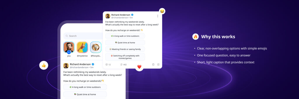
📊 6. Polls
Polls are perfect for quick opinions, decision-making, or playful questions.
6.1 Ask a clear, simple question
Ambiguity kills engagement — that’s especially true for polls.
Great polls ask:
- One question
- With one meaning
- In one line
6.2 Add tiny context above
A sentence or two helps people understand the poll’s purpose:
E.g. “Choosing features for next week — help us decide.”
6.3 Keep options clean
2 to 4 choices is ideal.
Options should be distinct and easy to choose between.
6.4 Underscore options with emojis
Used well, emojis draw the eye to the right places and reinforce your intended meaning.
Aim for an emoji, followed by a space, at the beginning of each option.
🧭 7. Quick Checklist
A fast “does my post look good?” guide:
Text & Formatting
- Short, clear paragraphs
- One idea per chunk
- Blank lines where needed
- No giant walls of text
Emojis
- Used sparingly
- Support the message
- Not overused or replacing words
Images
- High quality
- Relevant
- Visible on mobile
- Not cluttered
Stories
- Big text
- Clear contrast
- One idea per slide
If all of those feel true → your post is already better than 95% of the Internet.
🌈 8. Final Note: This Is a Toolkit, Not a Rulebook
Online+ is about expression, ownership, and individuality.
This guide isn’t here to police what you say, but to help your ideas shine.
If your post is:
- Easy to read
- Respectful
- Not designed to spread hate or FUD
…then you’re already aligned with the Online+ vibe.
Everything else is just style and ideas — and those are yours to play with.
Ready to put it into practice?
Start posting on Online+ and experiment with cleaner formats, stronger visuals, and stories that actually land.
👉 Join the conversation on Online+.